SecureAuth®
Blueprint Design System
When I began working at SecureAuth, the team had a foundation in place for their design system called Blueprint. This foundation primarily consisted of a set of Sketch symbols that were shared across the design team via Brand.ai and shared out to the one front-end developer working on building coded components via Zeplin. It was being used on a single product built within third-party software.
Today, Blueprint has a full set of coded components with built-in interactions, a single easy-to-maintain set of mockup components, and a small dedicated team of developers supporting the development of the companies core product UI and login experiences.
Timeline: 2 years (ongoing)
My role:
Initially, I developed the original process strategy with another Sr Designer, contributed to visual design of some components, built and maintained original Sketch files.
Currently, I act as the Product Manager and Design Lead for the product. I establish priority of work to be done, ensure that requirements for components are documented appropriately, assist and guide other team members on how to use the system components, and still occasionally create new component designs.
Background
The original design system was designed to work with a new R&D product, Cloud Access, and needed to closely align with the visual styles established by the third-party software platform that product was built on. While based on Brad Frost’s Atomic Design model and greatly inspired by the published work of the EightShapes team, the design system was treated more as a side project and progress towards scaling the system was limited in a few ways:
Visual designs had to look like the design from the third-party software platform and did not necessarily meet the needs of the SecureAuth brand
Without dedicated resources, the system was primarily made up of basic atom level components (ex. form fields, buttons, text styles, and colors) and had not quite achieved more sophisticated levels definition (interactions, accessibility features, or complex molecular level components)
Multiple tools were used to define components. Various aspects of the system were housed in Sketch files or on Brand.ai, Zeplin, Github, and JIRA/Confluence
Mobile and core products were unable to adopt the REACT based components due to technical stack constraints
Early Strategy
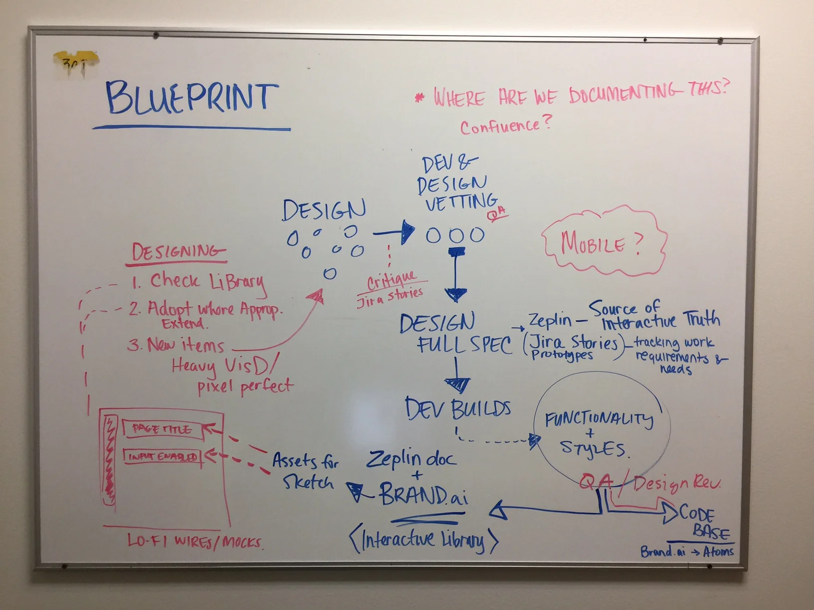
Early process ideas
Early on, myself and one of the other Senior Designers on the team developed a strategy to help us define a process for generating new components and updating existing components. We were primarily seeking to solve problems of process, component design delivery, and QA. We also wanted to account for how we expected the expanding design team to be able to adopt the Sketch versions of the components for use in their mockups.
We also created a set of goals for the product that included things like:
Make Blueprint is easy for designers, developers, and QA team members to use and implement consistently across the product portfolio.
Make it so it’s more difficult to use the component wrong than it is to use it right
Each component should be flexible enough to take apart if needed to implement a design
Blueprint codebase and design files need to be easy to update
Global updates should be made in one place and affect all product UIs (eg. updates to colors / branding)
Updates need to be backwards compatible
Avoid deprecating components as much as possible, when we do we should support them for a set period of time during which product developers should have time to make any necessary updates to old components
We operated under this strategy for about a year until a company rebrand, core product redesign, and additional resources gave us an opportunity to reassess how we were doing things. Within that year, we were able to improve the consistency of use of components, onboard new team members in using the design system, and continued to add a few more complex components to the code library.
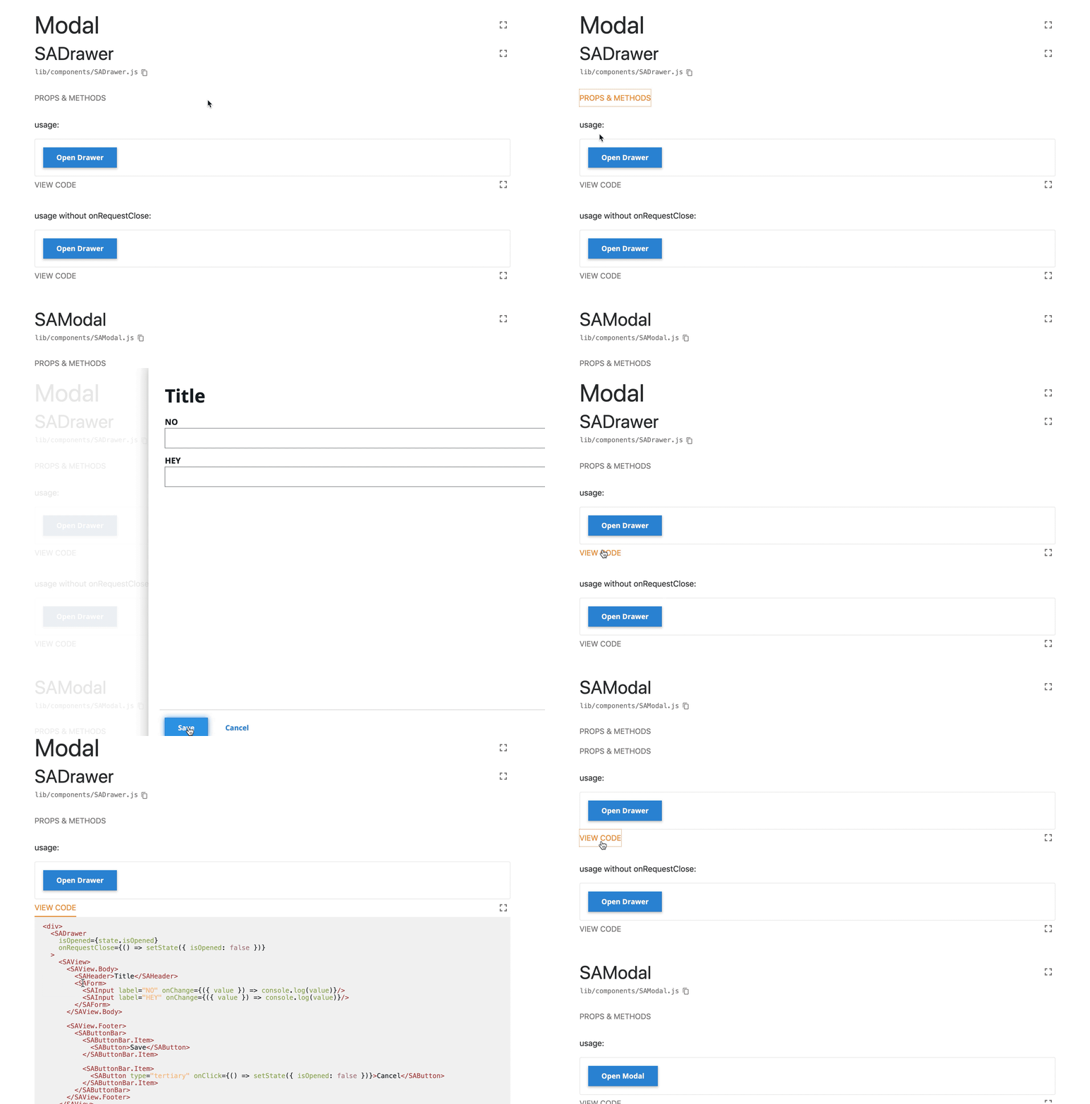
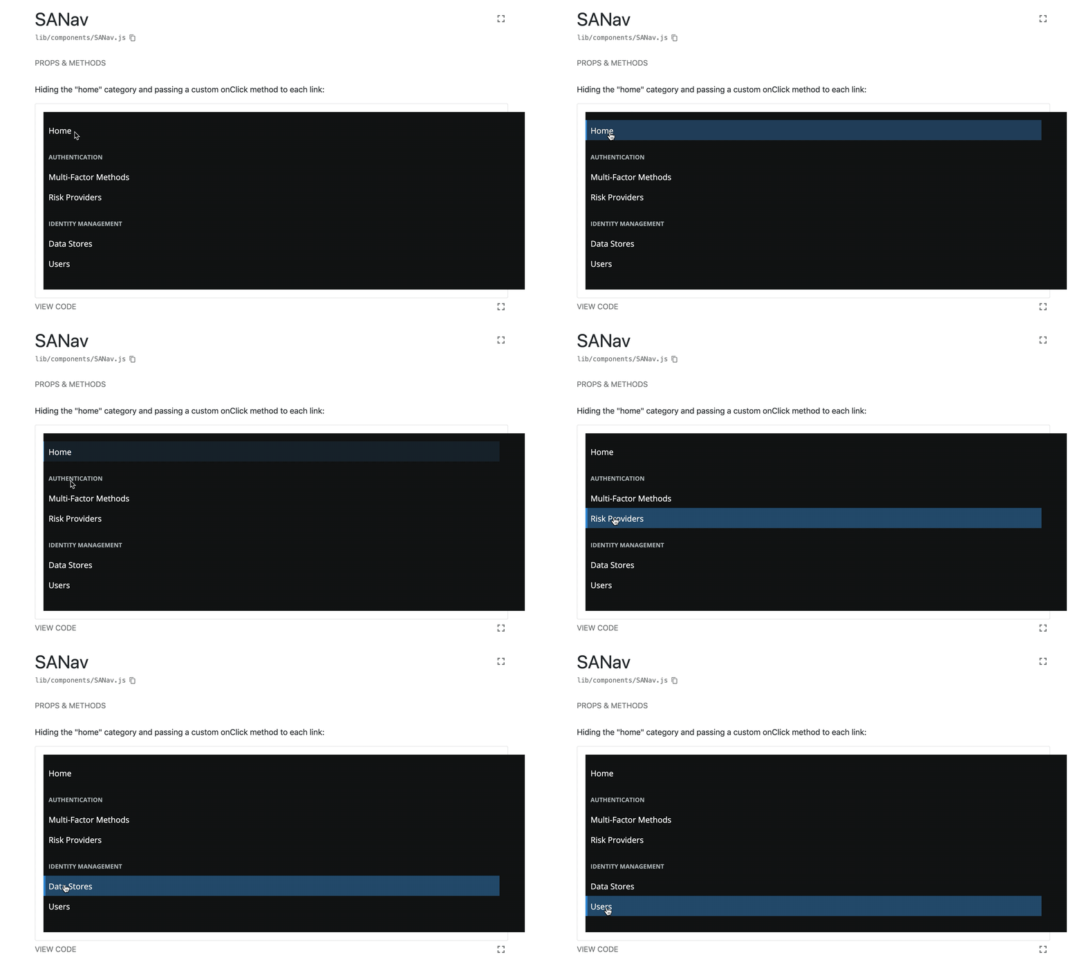
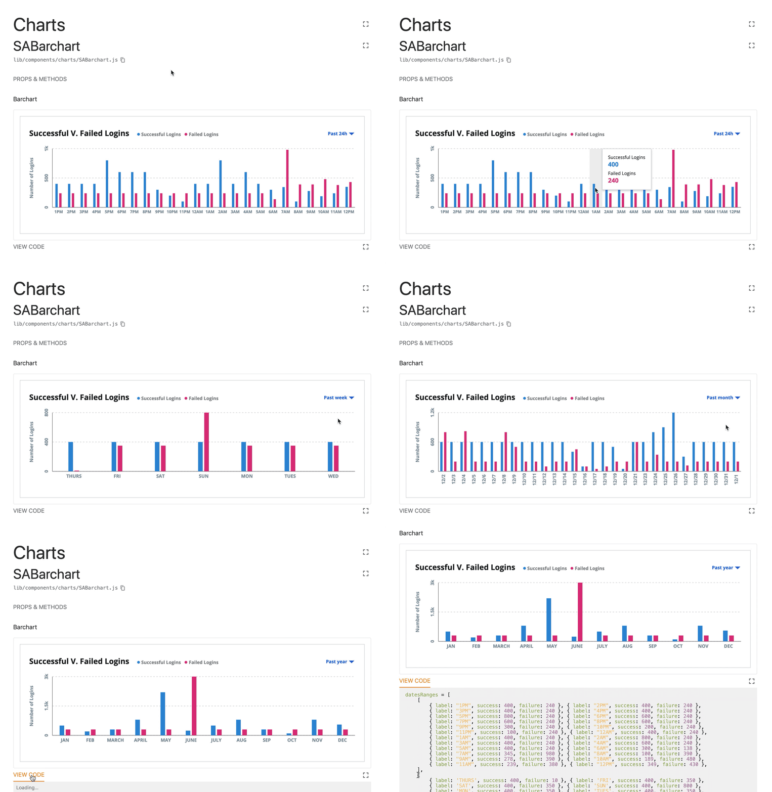
Complex Component Examples
Current Challenges
Coming Soon
Takeaways & Successes
SecureAuth has already had the opportunity to benefit from how easy it is to update the code and components for the design system. Once when we needed to update the entire systems color scheme twice — for an interim rebrand and again for the final rebrand to orange — and a second time when we needed to update the company logo across the entire product.
On both occasions, we reduced the tedious task of finding and replacing all instances of colors or logos throughout the product by hours, if not days, by simply replacing the variables used to define those values across the product.More Coming Soon


